PrismMedia.org Website redesign case study
From Clutter to
Clarity
Helping prospective students discover the right career path without friction.

The
Opportunity
Students were struggling to discover courses and understand outcomes.
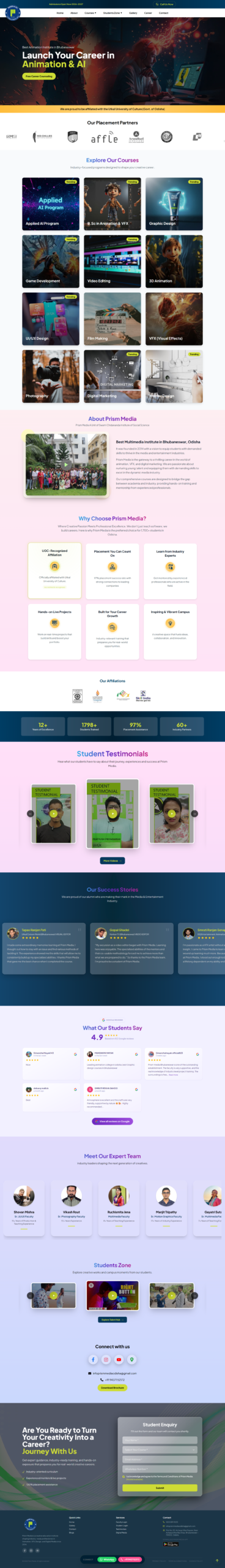
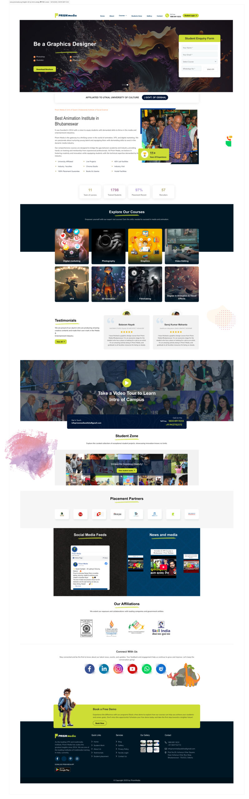
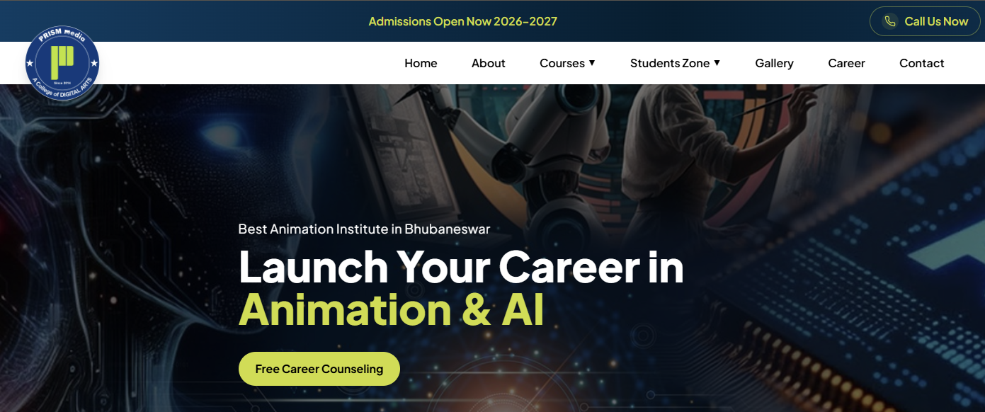
BEFORE
Lots of text to read and understand what this course is about so we converted cluttered text heavy content into modern understandable icons and cards to engage with and discover the course features and opportunities
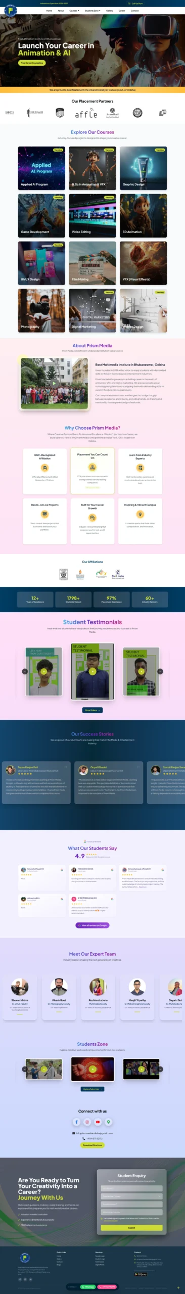
AFTER
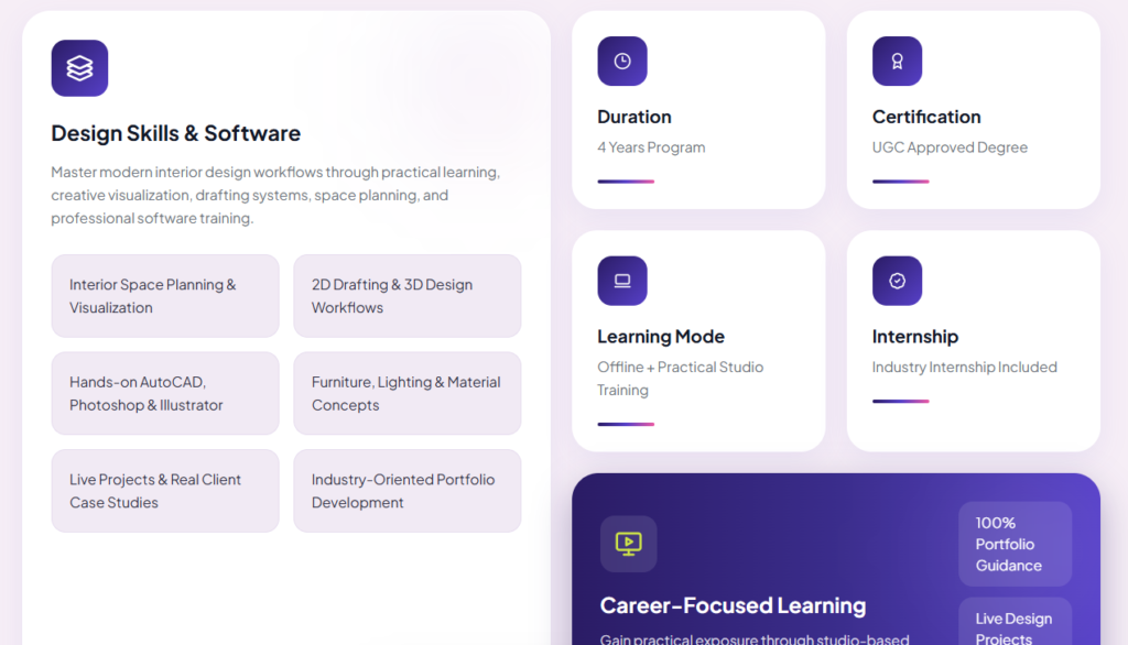
Learning modules explained with visual hierarchy.
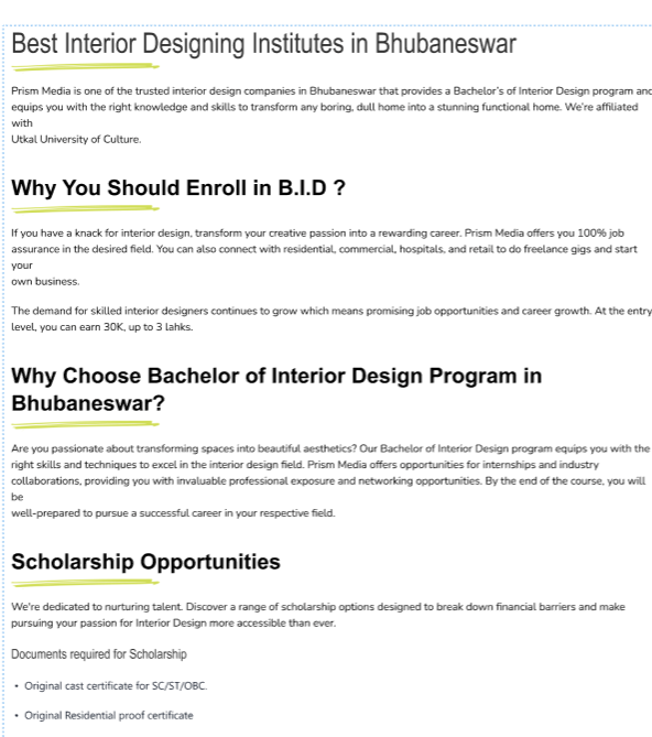
Clean curriculum explained and designed with course contents and tools to be used.
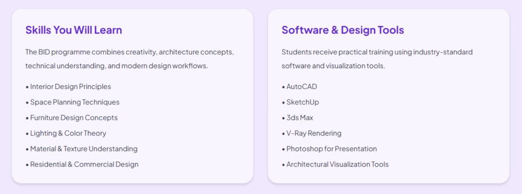
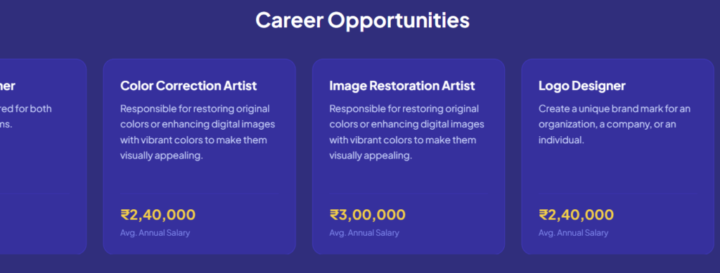
Showcase of skills and opportunities related to specific course.
The
Transformation
BEFORE EXPERIENCE
REDESIGNED EXPERIENCE
Building consistency through
a light weight
DESIGN SYSTEM
Colors

Primary Brand Colors
#003D64 Deep Navy Blue
#003D64 #001E31 #003D64
Muted Blue Gradient Base
Accent Colors
#CEDC36 Neon Lime Green
#8CFE4A Neon Green
#DBF24A Soft Lime Variant
Background & Neutrals
#FBFFEA #FFDEF8 #BCD7FF
Background Gradient
#FFFFFF Text Primary
#CFCFCF Text Secondary
Typography
Font Family
Plus Jakarta Sans
Research & Strategy
How I designed for clarity, trust and lead intent
User Flow : Homepage > Courses > Course Details > Inquiry
I identified the core user journey and built the information architecture around it. Every element on the homepage guides visitors toward specific discovery like courses, testimonials, affiliation and inquiry form, while course pages provide specific details and obvious inquiry entry points.
Mobile First
Navigation, forms and course cards were optimized for mobile.
Lead Capture
Inquiry forms strategically placed across the site.
Trust Signals
Reviews, affiliations and course outcomes highlighted.
SEO-friendly
Structured content hierarchy improves discoverability.
Course Discovery
Similar course recommendations improve exploration.
Mobile First
Responsive layouts for all devices.
How I used AI to accelerate the process?
Using AI as a multiplier, not a replacement for design judgment.
1. Prompt Design
Detailed prompts describing structure, hierarchy and styling systems.
2. Generate & Learn
Generated layouts, reviewed patterns and extracted insights.
3. Refine & Adapt
Improved responsiveness, accessibility and consistency.
4. Ship & Test
Tested across browsers, devices and optimized performance.